PortfolioBrand & Creative
Luxury Surface Brand
An integrated visual system designed to create a stronger digital presence for a premium surface-material brand.
- Project
- 01 / 10
- Discipline
- Brand & Creative
- Delivered
- Identity system
- Industry
- Premium surface materials
Overview
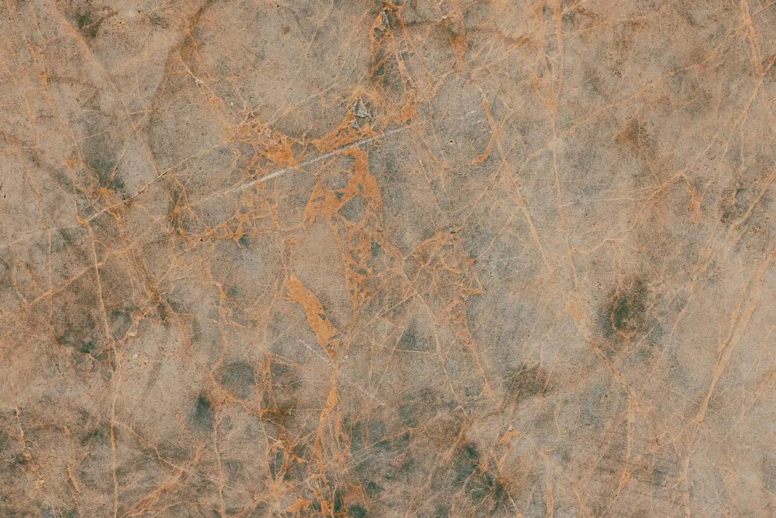
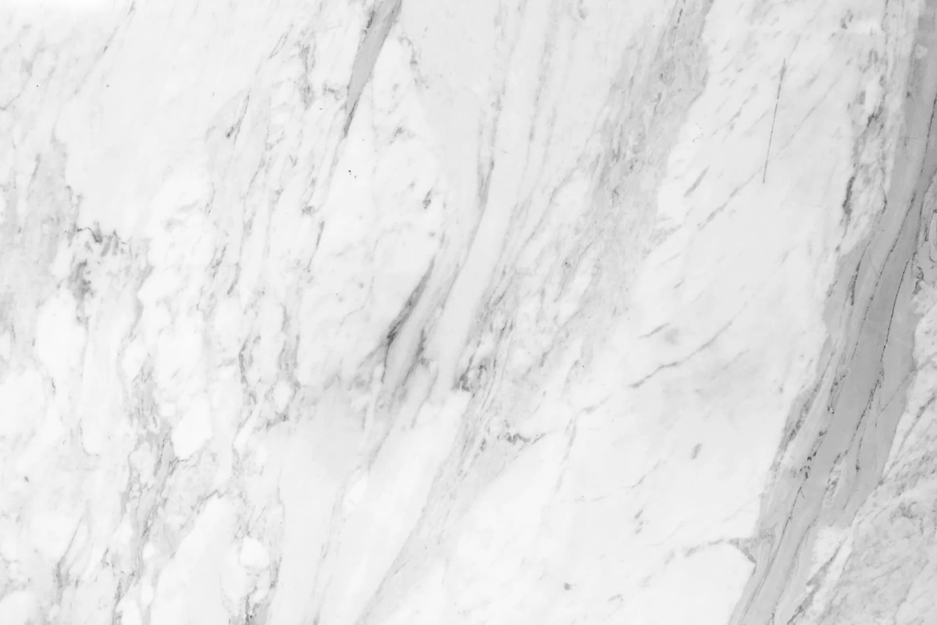
A brand system built around material rather than around a logo — colour, crop, typography and layout rules written so that every surface the brand appears on reads as the same brand, from a catalogue spread to a social tile.
Challenge and approach
The challenge
Surface materials are sold on texture and finish, and both flatten on a screen. The identity had to carry the sense of a physical material through formats where the material itself could not be touched, and stay recognisable at the sizes a feed actually shows.
The approach
Art direction was set from the material up: a fixed crop discipline that keeps surfaces filling the frame, a restrained palette that lets the product supply the colour, and a typographic hierarchy quiet enough that it never competes with the finish. The rules were then documented as templates rather than as a guideline PDF, so the system survives being used by other people.
Frames
Closer, and one more way.
These frames are a representative treatment of the discipline, not a record of the delivered files — the artwork is the studio’s own. Project photography is published here as each client releases it.
Presentation
The same piece built in three dimensions, turning as the page moves past it. It is a way of showing the work, not a second photograph of it — and not a substitute for the files themselves.
Process
How it was made.
- 01Crop and composition rules defined before any layout was drawn
- 02Template library built for thumbnail-size legibility
- 03One art direction carried across print and screen